How to Use Color Coding in Line Marking for Better Organization
Unlock the power of visual communication through strategic color selection in your facility's pavement markings.
When managing a high-traffic commercial property or a busy industrial warehouse, organization isn't just about cleanliness—it's about safety, efficiency, and flow. One of the most overlooked tools in facility management is the strategic use of color in line marking. While standard white or yellow lines serve their purpose for basic lane delineation, incorporating a multi-color approach can significantly reduce accidents and streamline movement.
At Capital Parking Lot Line Painting, we have seen firsthand how a well-planned color scheme can transform a chaotic lot into a highly organized environment. Whether you are managing a retail hub in Barrie or a massive distribution center, understanding the psychology and utility of color is key to professional property management.
The Psychology of Color in Line Marking
Colors trigger immediate subconscious responses. In the context of line marking, these responses can be harnessed to guide drivers and pedestrians without the need for excessive signage. By using specific hues, you create an intuitive language that users follow naturally.
Commonly Used Colors and Their Meanings
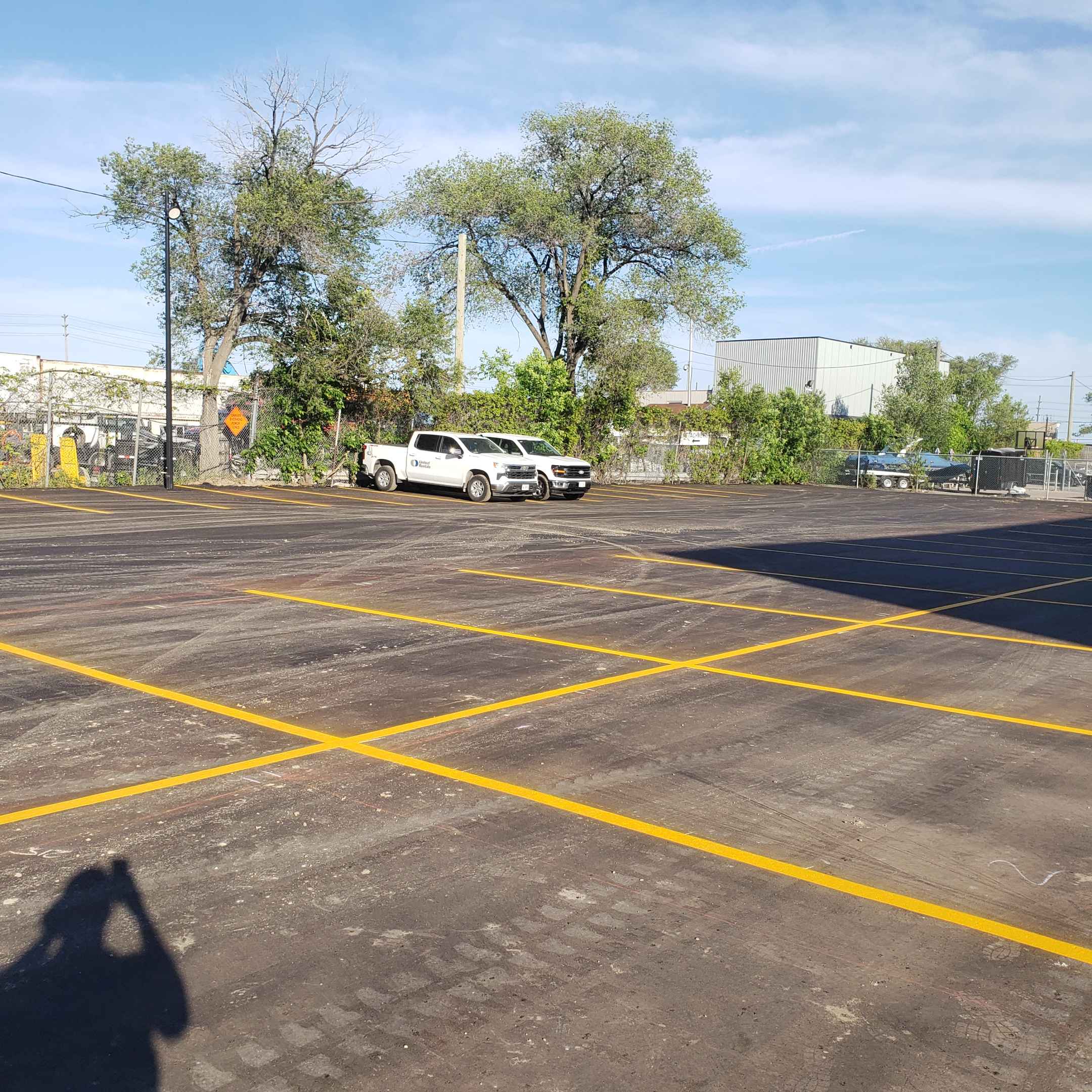
- White: The standard for parking stalls, lane dividers, and general directional guidance.
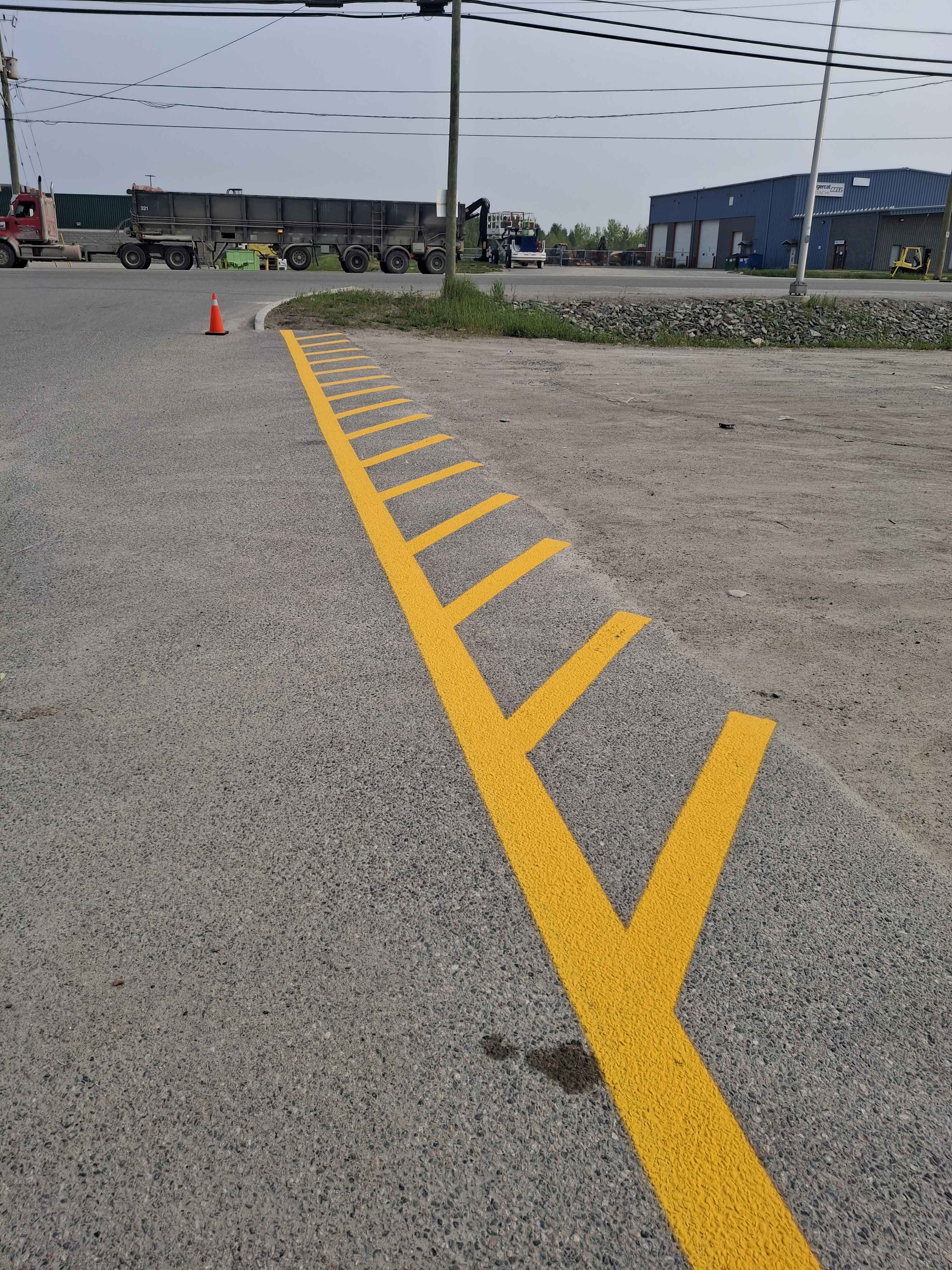
- Yellow: Highly visible and used for warning zones, caution areas, or to indicate high-traffic flow boundaries.
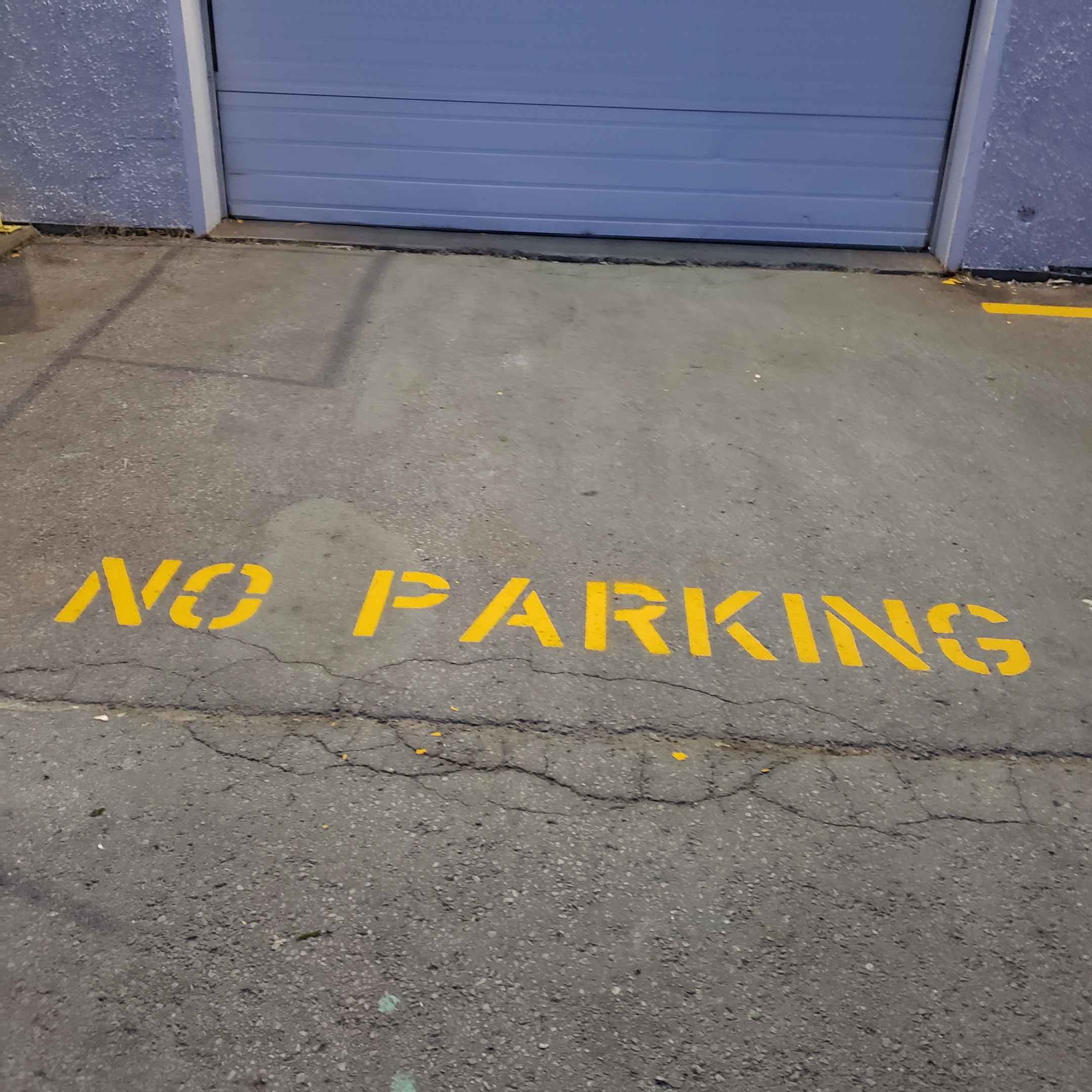
- Red: Reserved for immediate danger, "No Parking" zones, fire lanes, and emergency access points.
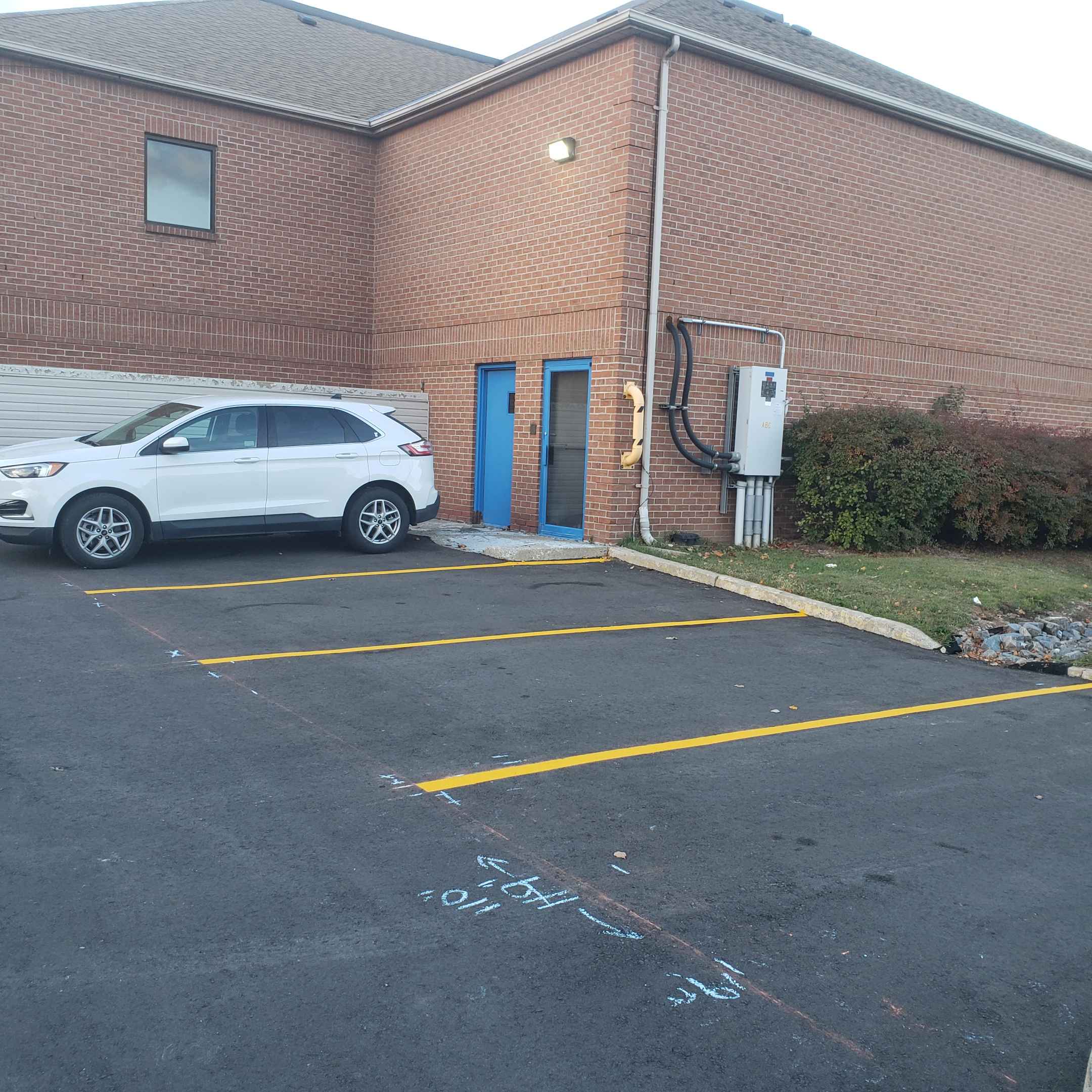
- Blue: The universal standard for accessible (handicap) parking and designated loading zones.
- Green: Often used for pedestrian walkways, bicycle lanes, or designated eco-friendly zones.
Implementing Color Coding in Different Environments
The application of color coding varies depending on whether you are working on an outdoor parking lot or an indoor industrial floor. Both require precision and high-quality materials to ensure longevity.
1. Commercial Parking Lots
In a bustling city like Barrie, parking lot management is critical for customer satisfaction. Using blue for accessible spots ensures compliance with accessibility standards, while red for fire lanes keeps emergency exits clear. Capital Parking Lot Line Painting recommends using high-contrast colors to ensure visibility during heavy rain or snow, which are common in Ontario.
2. Industrial and Warehouse Floors
Inside a warehouse, color coding is a vital component of OSHA-style safety protocols. You can use yellow lines to define forklift paths and green lines to mark designated walking paths for employees. This separation of machinery and pedestrians is the most effective way to prevent workplace injuries.
Professional Results with Capital Parking Lot Line Painting
Don't leave your safety to chance. Our team specializes in high-visibility, durable line marking solutions tailored to your specific organizational needs.
Common Mistakes to Avoid
While color coding is effective, improper execution can lead to confusion rather than clarity. Avoid these common pitfalls:
Overcomplicating the Palette
Using too many different colors can lead to "visual noise," where the user becomes overwhelmed and ignores all markings entirely.
Poor Contrast Selection
Applying a dark color on a dark asphalt surface makes the line invisible. Always ensure your color choice provides maximum contrast against the substrate.
Conclusion: Investing in Visual Order
Color coding in line marking is more than just an aesthetic choice; it is a strategic investment in safety and operational efficiency. By clearly defining zones, directing traffic, and highlighting hazards, you create a more professional and secure environment for everyone.
If you are looking to upgrade your facility's organization, contact Capital Parking Lot Line Painting today. We provide expert guidance and professional application to ensure your lines are bright, durable, and perfectly placed.