How to Use Color Coding in Line Marking for Better Organization
Unlock the power of visual communication to enhance safety and efficiency in your facility.
In any high-traffic environment—be it a busy retail parking lot, a sprawling warehouse, or a complex industrial site—organization is the key to operational success. While many view pavement markings as mere boundaries, professional organizations understand that they are a sophisticated language of communication. By utilizing strategic color coding in line marking, you can direct movement, designate specific zones, and significantly reduce accidents.
At Capital Parking Lot Line Painting, we specialize in helping businesses implement these visual systems to create safer, more intuitive spaces. Whether you are managing a commercial lot in Kingston or a private industrial complex, understanding the psychology of color in line marking is your first step toward better management.
The Psychology of Color in Line Marking
Color is the fastest way for the human brain to process information. In the context of line painting, colors act as instant signals that require little to no conscious thought from drivers, pedestrians, or forklift operators. When colors are applied consistently, they create a predictable environment that minimizes confusion.
Common Color Standards and Their Uses
While specific regulations may vary depending on your local municipality in Kingston, certain universal standards are widely recognized in the industry:
- Yellow: Typically used for warning signs, hazard boundaries, and caution areas. It is highly visible and signals a need for heightened awareness.
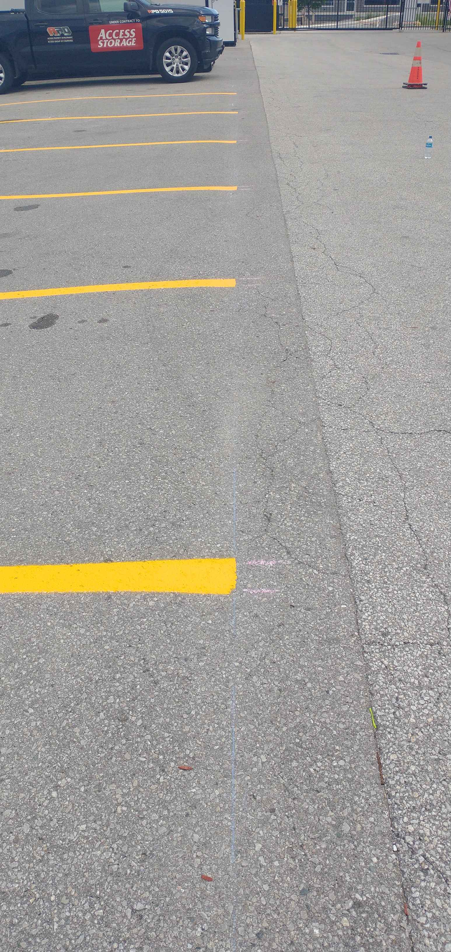
- White: The standard for parking stalls, lane dividers, and general directional guidance in most parking lots.
- Blue: Universally recognized for accessibility. Using blue for designated handicap parking ensures compliance and immediate recognition.
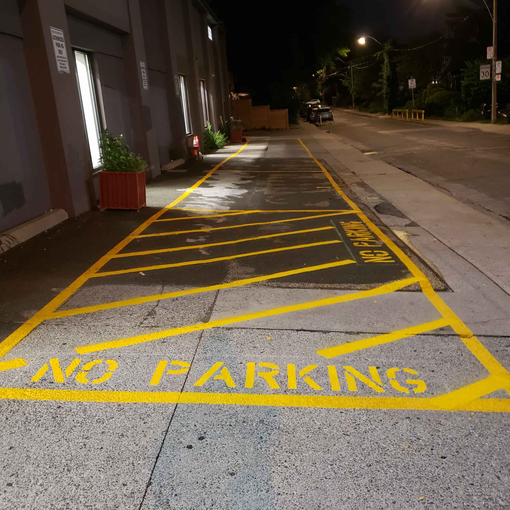
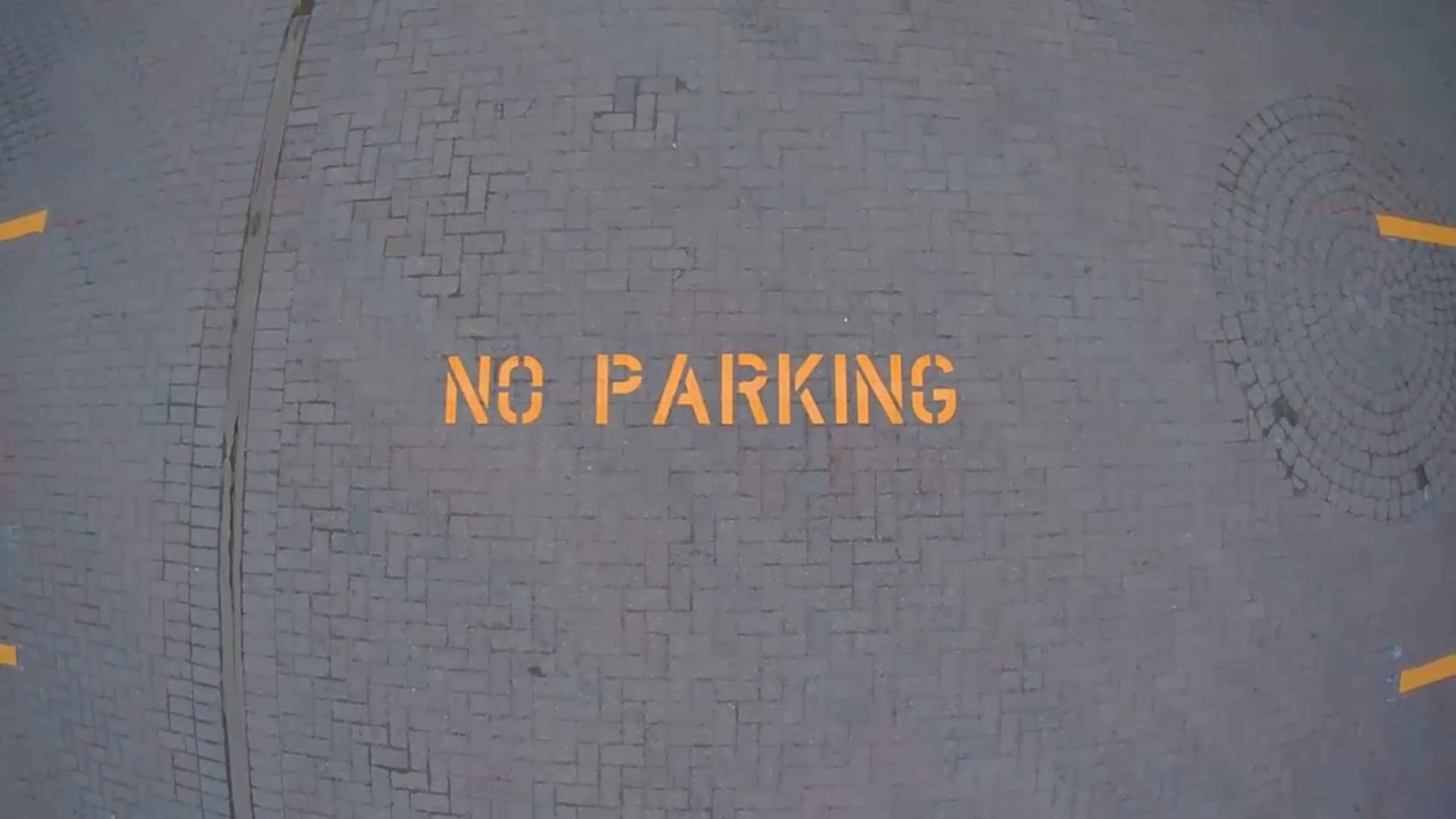
- Red: Reserved for high-importance zones such as fire lanes, no-parking zones, or emergency equipment access.
- Green: Often used to denote pedestrian walkways, safe zones, or eco-friendly areas like EV charging stations.
Strategic Applications for Better Organization
Implementing color-coded line marking isn't just about aesthetics; it's about functional logic. Here is how different sectors benefit from advanced line painting strategies:
1. Commercial Parking Lots
For retail businesses, organization translates directly to customer satisfaction. By using distinct colors for customer parking versus employee parking, or by clearly marking loading zones in red, you prevent congestion and ensure that your most important visitors have easy access to your storefront. Capital Parking Lot Line Painting can help design a layout that maximizes your available space while maintaining clear flow.
2. Industrial and Warehouse Environments
In a warehouse, safety is paramount. Color coding can separate pedestrian paths from heavy machinery lanes. For example, painting a bright green path for workers to walk through ensures they stay out of the way of forklifts, which might be operating within white or yellow-bordered lanes. This visual separation is one of the most effective ways to prevent workplace injuries.
3. Traffic Flow and Directional Guidance
In large complexes, drivers often feel lost. Using directional arrows and colored guide lines can lead visitors from the entrance to specific zones (e.g., a blue line leading to visitor parking or a white line leading to the main exit). This reduces idling time and minimizes the risk of accidents caused by sudden turns or confusion.
Common Mistakes to Avoid
Even with the best intentions, poorly executed line marking can cause more confusion than clarity. Avoid these common pitfalls:
- Inconsistency: Using different colors for the same purpose in different areas of the property.
- Faded Markings: Using low-quality paint that loses its color quickly, leading to ambiguity.
- Overcomplication: Using too many different colors, which can overwhelm the viewer and negate the purpose of the signal.
- Poor Contrast: Not ensuring the color stands out clearly against the asphalt or concrete surface.
To ensure your project is done right the first time, it is essential to work with professionals like Capital Parking Lot Line Painting. We ensure that every line is crisp, every color is vibrant, and every layout follows industry best practices.
Summary: Visual Clarity Equals Safety
Effective organization is not an accident; it is a designed outcome. By investing in high-quality line marking and thoughtful color coding, you are investing in the safety of your employees, the convenience of your customers, and the overall efficiency of your property. Don't leave your facility's organization to chance—let the colors guide the way.
Quick View