How to Integrate Accessible Parking Symbols Properly
Ensuring inclusivity through precision line marking and compliant symbol placement.
In any bustling urban environment, such as the high-traffic streets of Toronto, accessibility is not just a courtesy—it is a legal and ethical requirement. For property managers and business owners, the way you designate and mark accessible spaces speaks volumes about your commitment to inclusivity. Integrating accessible parking symbols is a specialized task that requires more than just a bucket of paint; it requires precision, knowledge of local regulations, and high-quality execution.
At Capital Parking Lot Line Painting, we understand that these symbols serve as a vital beacon for individuals with disabilities. When these markings are faded, misplaced, or incorrectly sized, they create barriers rather than solutions. This guide explores how to properly integrate these essential elements into your parking lot design.
The Importance of Regulatory Compliance
Accessibility standards are strictly governed to ensure uniformity across the province. In a top 30 city like Toronto, municipal inspectors and provincial guidelines are rigorous regarding how parking spaces are delineated. Improperly placed symbols can lead to more than just confusion; they can result in significant compliance issues for your business.
Proper integration involves adhering to specific dimensions for the International Symbol of Access (ISA). This includes the correct scale of the wheelchair icon relative to the stall size and the specific blue-and-white color contrast required for maximum visibility. Relying on professional services like Capital Parking Lot Line Painting ensures that your markings meet these critical standards from day one.
Best Practices for Symbol Integration
When planning your next lot maintenance project, consider these technical factors to ensure your accessible spaces are functional and visible:
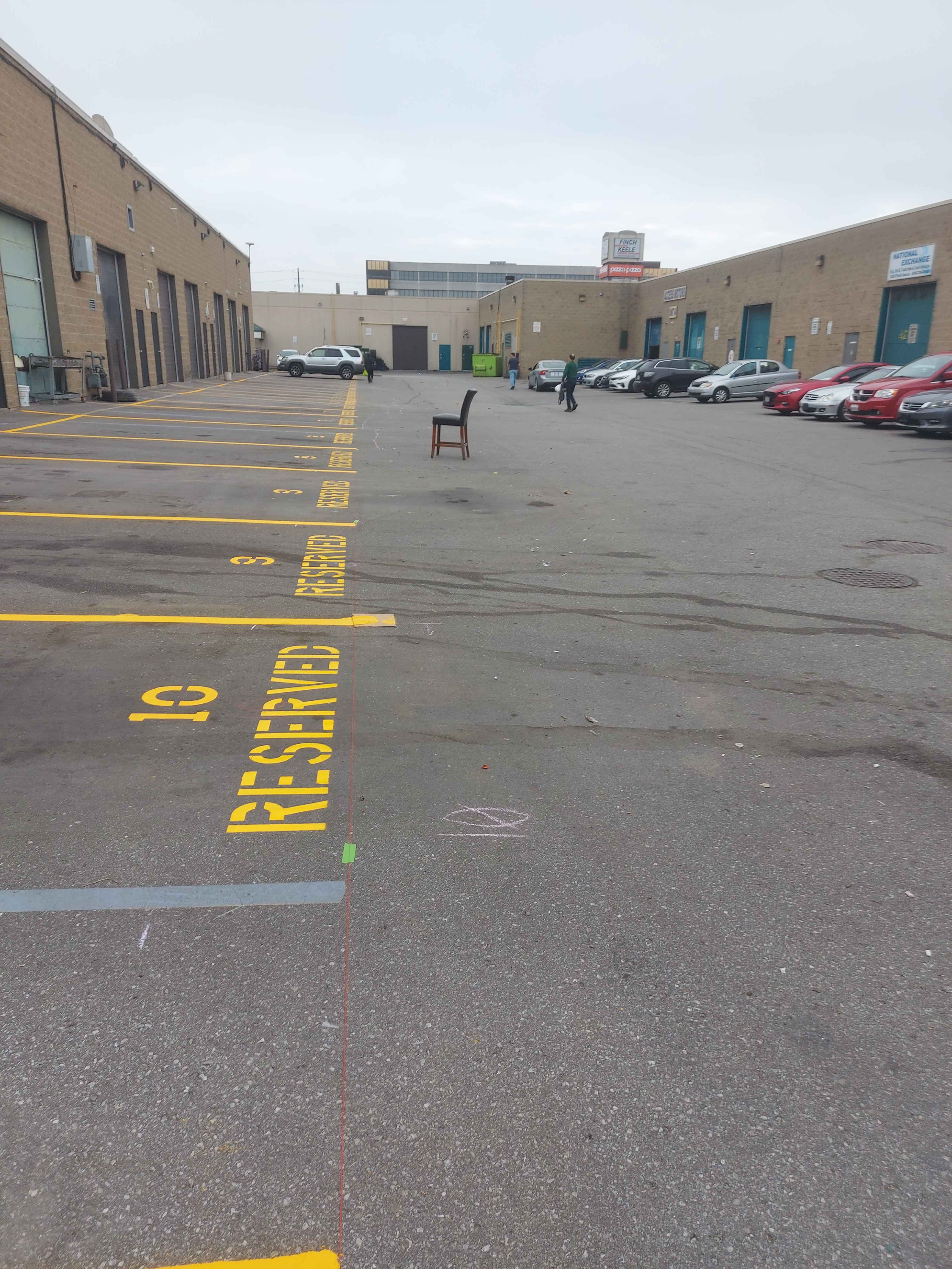
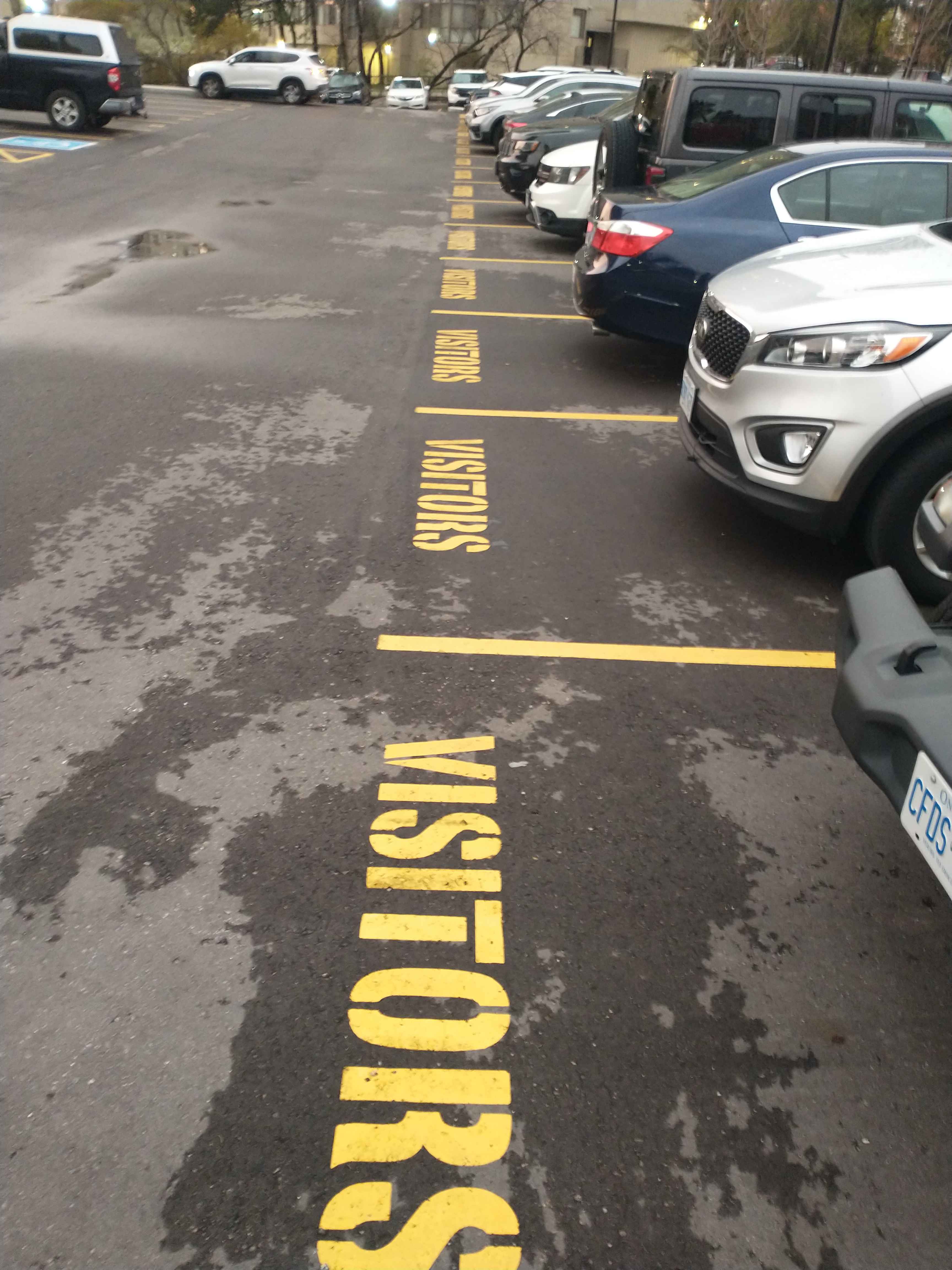
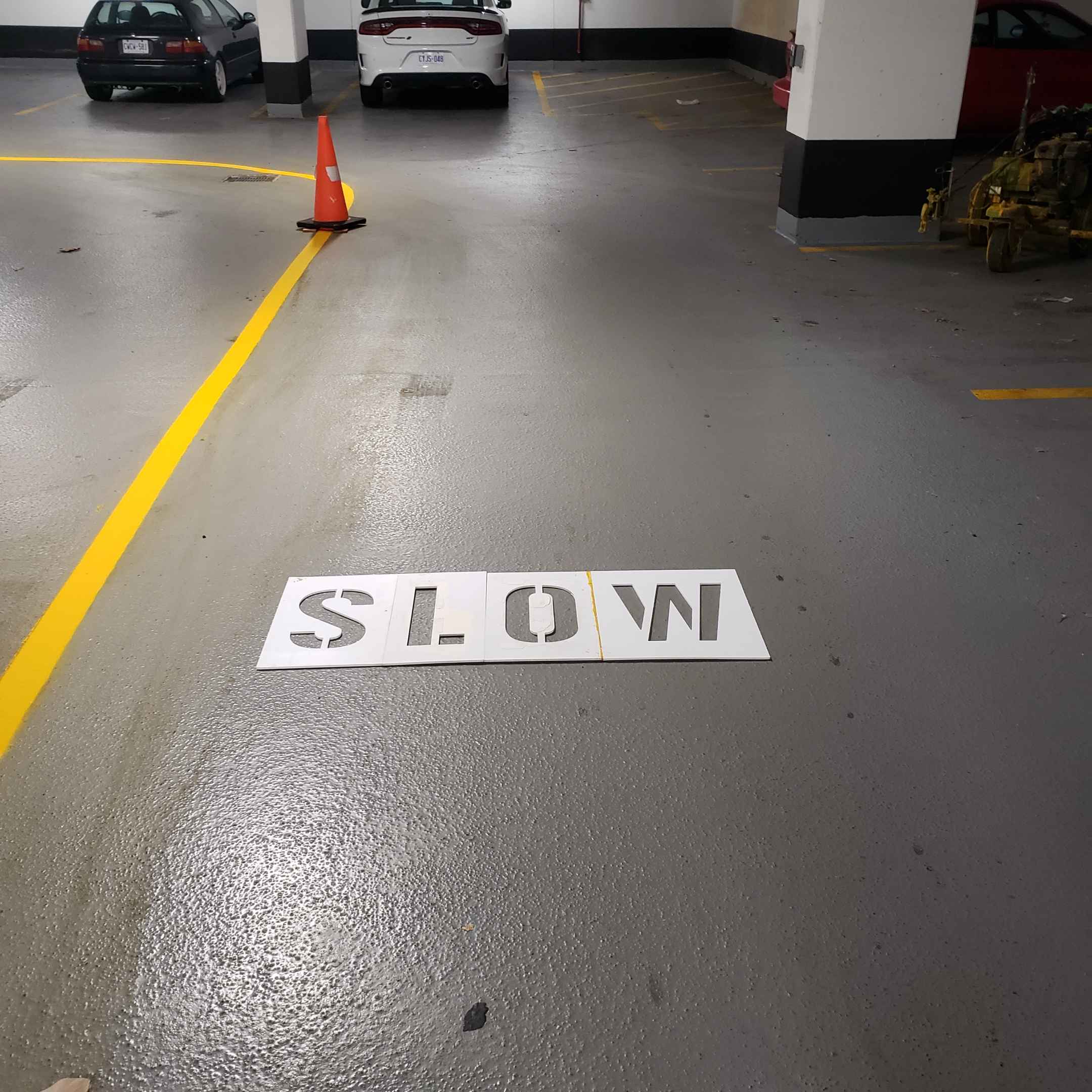
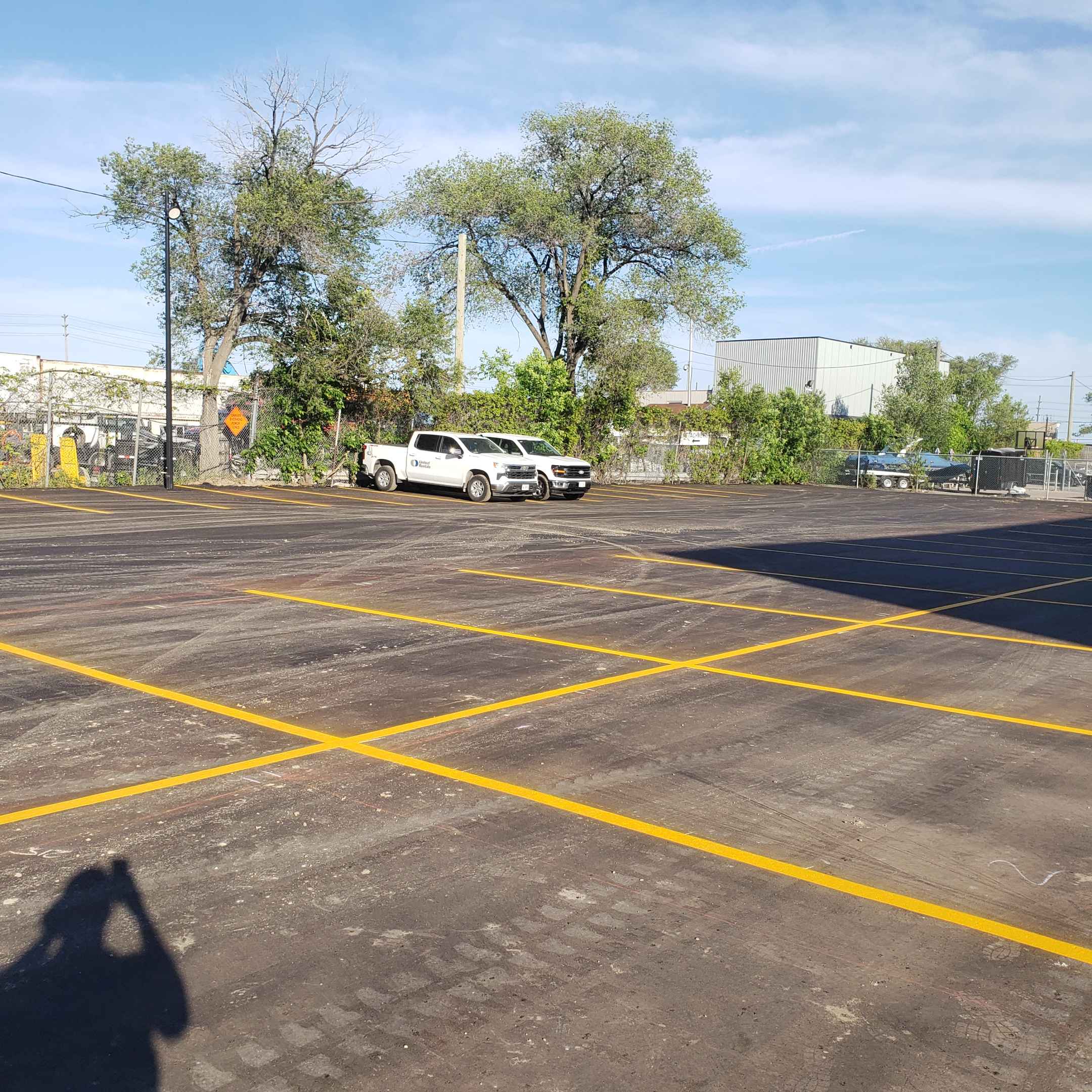
- High-Contrast Colors: Always use high-visibility, traffic-grade paint. The contrast between the symbol and the asphalt is crucial for those with visual impairments.
- Strategic Placement: The symbol should be centered within the designated stall or placed according to specific local accessibility codes to ensure it is clearly identifiable from a distance.
- Aisle Access: Integration isn't just about the symbol; it's about the adjacent access aisle. Proper line marking must define the space required for ramps and mobility devices.
- Durability: Use heavy-duty materials that can withstand the heavy friction and weather fluctuations common in Ontario.
Common Mistakes to Avoid
Many property owners attempt to DIY their parking lot maintenance, which often leads to costly mistakes. Avoiding these pitfalls will save you time and ensure long-term safety:
Inaccurate Scaling
Using a symbol that is too small makes it difficult to recognize from a moving vehicle, while a symbol that is too large can bleed into adjacent lines, causing confusion.
Poor Surface Preparation
If the surface isn't cleaned properly before line marking begins, the paint will peel prematurely, leaving your accessible symbols illegible within months.
Why Professional Line Marking Matters
Precision is the difference between a parking lot that works and one that fails. Professional line marking involves specialized equipment that guarantees straight lines, consistent widths, and perfectly scaled symbols. Capital Parking Lot Line Painting utilizes industry-leading techniques to ensure that every accessible space is a model of clarity and compliance.
By investing in professional application, you are not only protecting your property's legal standing but also enhancing the user experience for every customer who relies on these designated spaces.
Ready to Upgrade Your Facility?
Don't leave your accessibility compliance to chance. Ensure your parking lot is safe, compliant, and professional with expert assistance.