How to Integrate Accessible Parking Symbols Properly
Ensuring accessibility is not just a legal requirement; it is a fundamental aspect of creating an inclusive environment for all members of the community.

In any bustling urban center, such as Windsor, the demand for well-organized and compliant parking facilities is constant. For property managers and business owners, ensuring that accessible parking spaces are clearly marked and correctly positioned is a top priority. Proper integration of accessible symbols involves much more than just slapping a blue icon on the ground; it requires precision, adherence to local regulations, and high-quality line marking.
When you partner with professionals like Capital Parking Lot Line Painting, you ensure that your facility meets the highest standards of visibility and durability. This guide explores the technical and ethical nuances of implementing accessible parking symbols effectively.
Understanding the Core Components of Accessible Parking
An accessible parking space is defined by more than just the single stall. To be truly functional, it must include specific spatial elements that allow individuals with mobility aids to enter and exit vehicles safely.
1. The Access Aisle
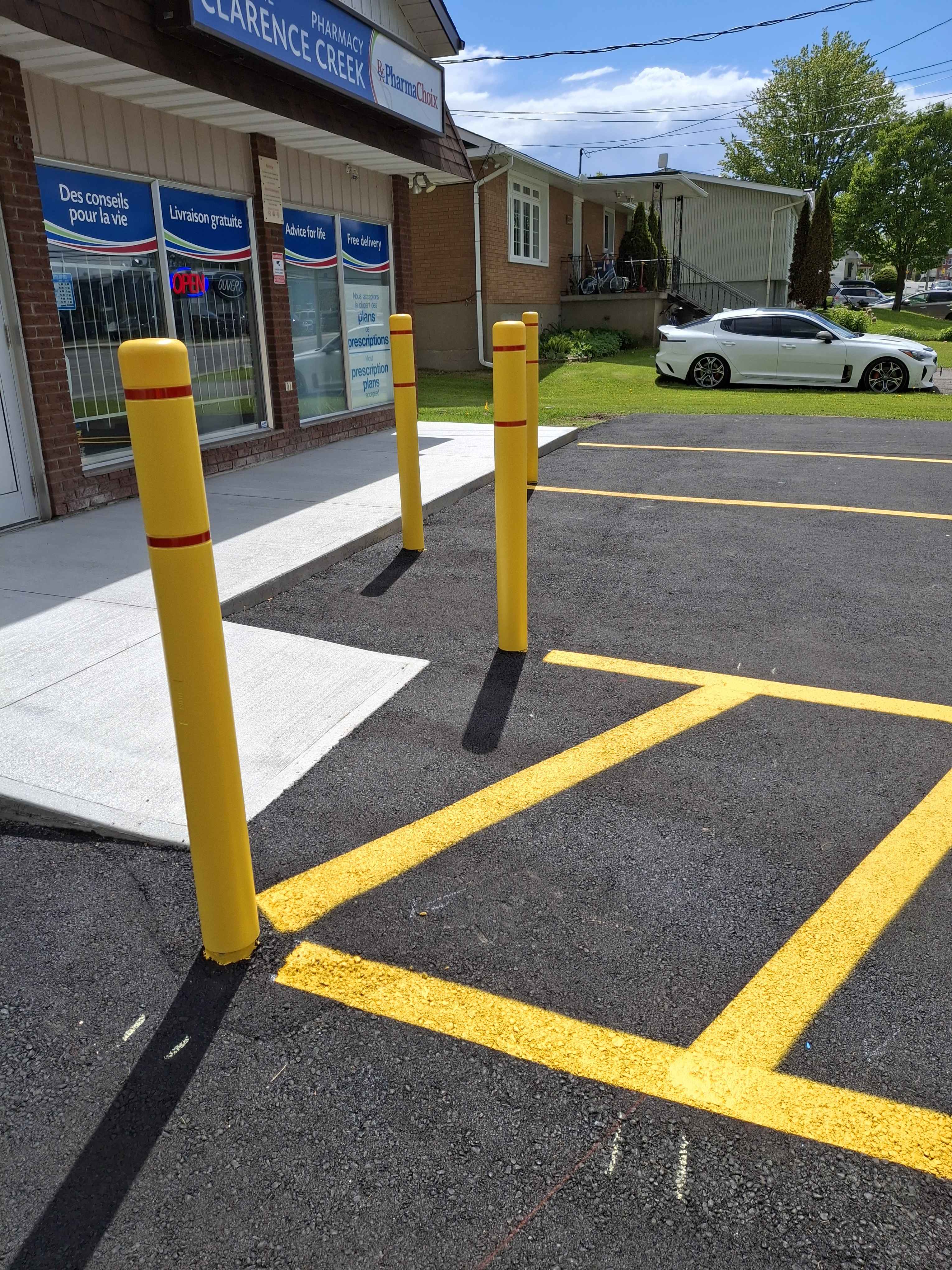
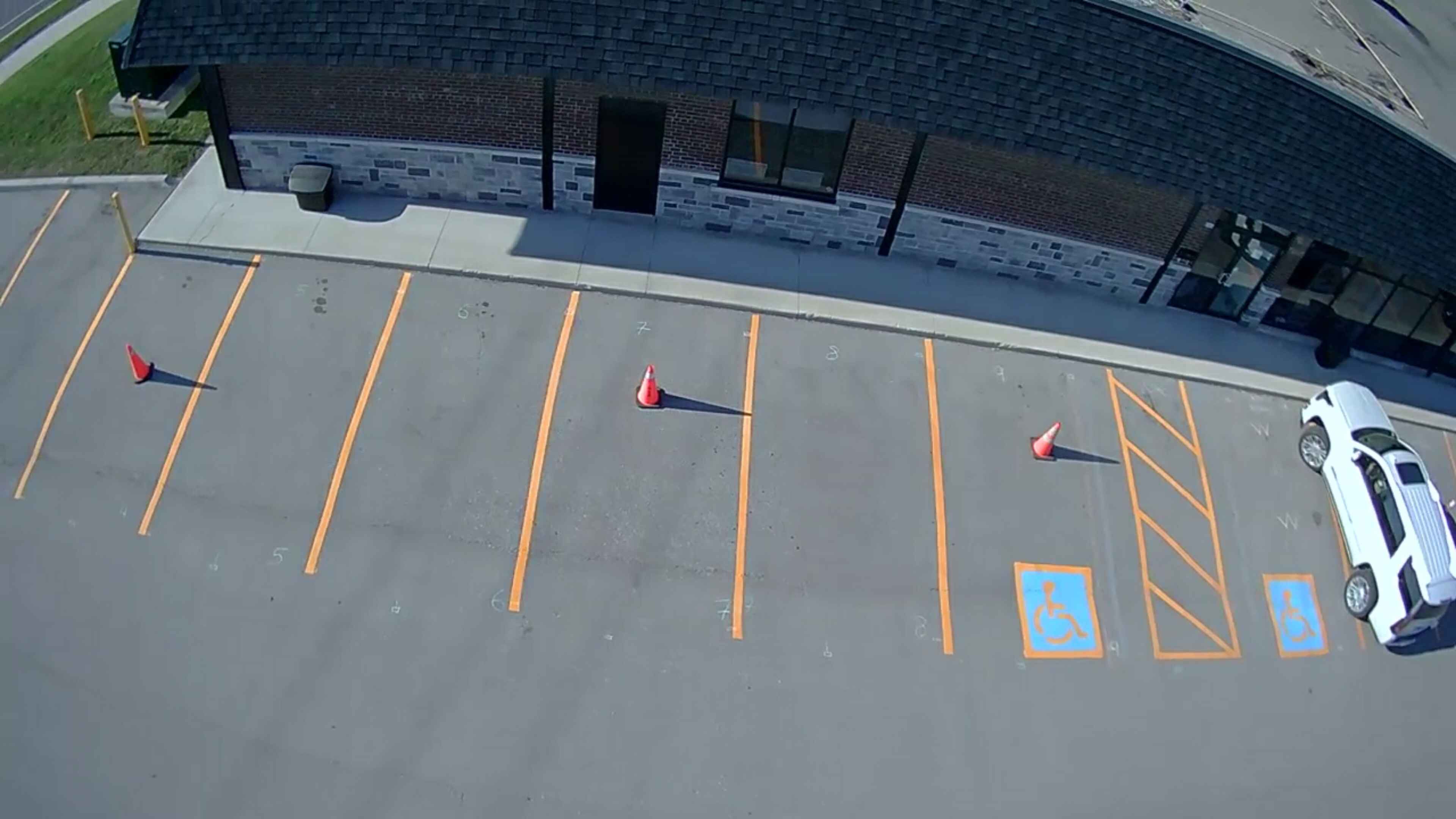
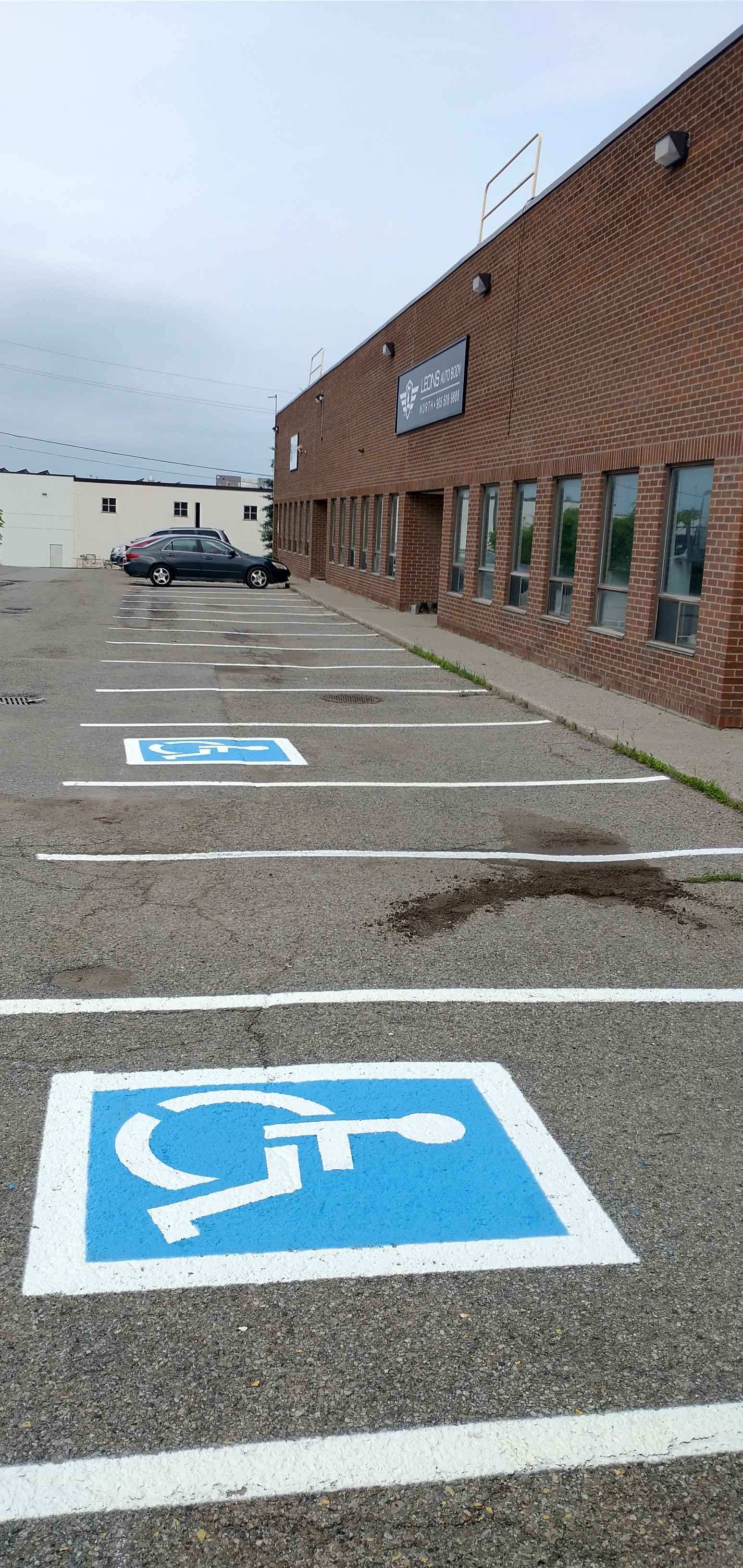
The access aisle is the striped area adjacent to the parking stall. This space is vital for wheelchair users to deploy ramps or lifts. Without a clearly defined access aisle through professional line painting, the stall becomes virtually useless for those who need it most.
2. The International Symbol of Accessibility (ISA)
The blue and white icon is globally recognized. However, the placement and size of this symbol are strictly regulated. It must be large enough to be legible from a distance and positioned in a way that it isn't obscured by vehicles parked in adjacent spots.
Common Mistakes to Avoid
Many property owners attempt to handle line marking in-house or hire uncertified contractors, leading to costly mistakes. Avoid these common pitfalls:
- Incorrect Symbol Sizing: Using symbols that are too small for the stall dimensions.
- Poor Contrast: Failing to use high-contrast colors, making the markings invisible in low-light or rainy conditions.
- Improper Aisle Width: Not providing enough clearance for modern motorized wheelchairs.
- Faded Markings: Using low-quality paint that wears away after a single season.
- Misalignment: Failing to align the symbols with the stall lines, creating a disorganized appearance.
The Importance of Professional Line Painting
In a top 30 city in Ontario like Windsor, local bylaws regarding accessibility are strictly enforced. Using a professional service like Capital Parking Lot Line Painting guarantees that your line painting adheres to the specific requirements of the province and the municipality.
Professional application involves more than just paint. It includes surface preparation, choosing the correct thermoplastic or epoxy materials, and using precision equipment to ensure every line is straight and every symbol is perfectly centered. This level of detail prevents the ambiguity that often leads to non-compliance fines.
Best Practices for Long-Term Maintenance
Once your accessible symbols are installed, they require upkeep. Environmental factors in Ontario—such as heavy snow, salt usage, and temperature fluctuations—can degrade even the best line marking.
We recommend a regular inspection schedule. Check for cracks in the paint, fading of the blue ISA symbol, and any buildup of debris in the access aisles. Periodic refreshing of the lines by Capital Parking Lot Line Painting can extend the life of your asphalt and maintain the professional look of your property.
Ready to Upgrade Your Facility?
Don't leave your compliance to chance. Whether you are managing a retail complex, a hospital, or a municipal lot, ensure your parking surfaces are safe, accessible, and professional.